Using Hover Help Text in Visualforce
The Problem
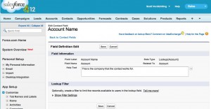
When you enter Help Text into any field in Salesforce, the user is able to view it by hovering their mouse cursor over the field’s icon in a standard view page. But how can you access that help text in a Visualforce page?
The Solution
The easiest solution is to use the helpText attribute in the < apex:PageBlockSectionItem > tag, but in order to do this, you need to include a < apex:PageBlockSection > nested in a < apex:PageBlock > tag as well. We wanted to avoid using Page Blocks for our page, so this left us scrambling for some kind of alternative to the helpText attribute.
Here comes CSS to the rescue!
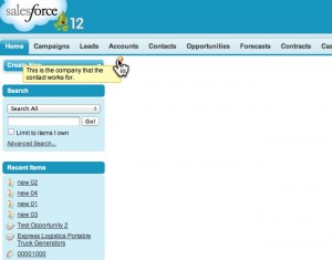
By using the “helpOrb” class supplied by the standard SFDC stylesheets, and adding our own CSS on top of that, we were able to replicate the look and feel of the hover text seen in other pages.
In this example, we took the Help Text entered in the Contact’s “Account Name” field, but you can substitue it with your own text where you see fit.
<apex:page >
    <style>
        .vfHelpText a            {position:relative;}
        .vfHelpText a span       {display: none;}
        .vfHelpText a:hover span {display: block;
                                  position:absolute;
                                  top:1.25em;
                                  padding:2px 5px;
                                  left:-15em; width:15em;
                                  z-index:100;
                                  border:1px solid orange;
                                  background-color:#FEFDB9;
                                  color:black;
                                 }
    </style>
    <span class="vfHelpText">
        <apex:outputLink value="javascript:return false;">
            <img src="/s.gif" alt="" class="helpOrb" />
            <span>{!$ObjectType.Contact.fields.AccountId.inlineHelpText}</span>
        </apex:outputLink>
    </span>

</apex:page>
The Fine Print
As always, please be careful about using this code, as calling on the “helpOrb” class is not officially supported by Salesforce. They can very easily break it in a future release and have no obligation to support it at all.
Contact us by adding a comment below, or @ reply us on Twitter if you have any questions. We’re on Facebook too!
- Visualforce Charting in Salesforce Winter ’13 - September 25, 2012
- Creating a Geolocation Trigger in Salesforce Winter ’13 - September 12, 2012
- Business Days – The Missing Salesforce Function - August 13, 2012


