Visualforce Charting in Salesforce Winter ’13

I have been absolutely excited about Visualforce Charting ever since we saw our first demo of the feature in pilot a year ago, and now I am happy to see it become GA in Winter ’13. Many of our clients are using Google Charts to render their data in Visualforce, but now with charting enabled directly on the page, we have better control and the ability to modify the chart dynamically.
How would you like to chart the changes of a number field by pulling its field history from Apex? Or maybe we need to compare data from our Salesforce org with information we’re pulling live from an external service with a call out.
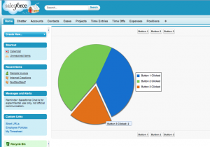
To demonstrate just how dynamic these charts can be, I have put together a very simple Visualforce page that renders data completely generated by you. The page has three buttons and a pie chart showing the number of times you have clicked each one. So when you first enter the page, there is nothing to be displayed on the chart, but as you click each button multiple times, you will see the chart change right in front of you.
First we need our controller to create a data wrapper class and handle the button click actions. Since we are using a pie chart, we only need one data value in our wrapper class to record our clicks.
public class ChartDemoController {

    // Data wrapper class
    public class Data {
        public String name { get; set; }
        public Integer clicks { get; set; }
        public Data(String name) {
            this.name = name;
            this.clicks = 0;
        }
    }

    // Our data points
    public List<Data> dataPoints {get;set;}

    // Controller sets three buttons to 0 clicks
    public ChartDemoController(){
        this.dataPoints = new List<Data>();
        this.dataPoints.add(new Data('Button 1 Clicked'));
        this.dataPoints.add(new Data('Button 2 Clicked'));
        this.dataPoints.add(new Data('Button 3 Clicked'));
    }

    // Button 1 clicked
    public PageReference button1() {
        this.dataPoints[0].clicks++;
        return null;
    }

    // Button 2 clicked
    public PageReference button2() {
        this.dataPoints[1].clicks++;
        return null;
    }

    // Button 3 clicked
    public PageReference button3() {
        this.dataPoints[2].clicks++;
        return null;
    }

}
And now we create a basic Visualforce page to display the buttons and pie chart:
<apex:page controller="ChartDemoController">
  <apex:form >
      <apex:pageBlock >
          <!-- The three buttons to click -->
          <apex:pageBlockButtons >
              <apex:commandButton action="{!button1}" value="Button 1" reRender="chartSection"/>
              <apex:commandButton action="{!button2}" value="Button 2" reRender="chartSection"/>
              <apex:commandButton action="{!button3}" value="Button 3" reRender="chartSection"/>
          </apex:pageBlockButtons>

          <!-- Our pie chart -->
          <apex:pageBlockSection columns="1" id="chartSection">
              <apex:chart data="{!dataPoints}" height="400" width="500">
                 <apex:legend position="right"/>
                 <apex:pieSeries labelField="name" dataField="clicks">
                     <apex:chartTips height="20" width="120"/>
                 </apex:pieSeries>
            </apex:chart>
          </apex:pageBlockSection>
      </apex:pageBlock>
  </apex:form>
</apex:page>
And that’s it! With just these simple lines of code, we have a pie chart that changes shape with each button click, and has some nice animations when we move our mouse over each slice.
You can download the source code used in this post on the Internet Creations GitHub repository. If you have any questions about our Visualforce Charting demo, contact us by adding a comment below, or @ reply us on Twitter. We’re on Facebook too!
- Visualforce Charting in Salesforce Winter ’13 - September 25, 2012
- Creating a Geolocation Trigger in Salesforce Winter ’13 - September 12, 2012
- Business Days – The Missing Salesforce Function - August 13, 2012


