Documents, Files, and Content, Oh My!
Yes, it’s true. I typically have nothing but positive things to say about the features of Salesforce and how the entire CRM platform helps customers to work more efficiently and productively.
In addition to being so useful, Salesforce provides an entire customer community for asking questions, sharing ideas, and learning from experts in the industry all within a tab in your browser.
For some time, I had considered using this tool to submit my comments and suggestions concerning the Salesforce CRM Content user interface, as well as Libraries, Files, and Documents. However, before sharing any ideas, I’d like to ask for input to help shape a more constructive and robust solution to a common frustration. My confusion surrounding Salesforce Content has only increased since I hopped on the sfdc bandwagon in 2009. Let’s use this opportunity to discuss what is (sort of) working, what could be done better, and what just plain drives us crazy.
Salesforce CRM Content: Why is this so confusing?
According to Salesforce’s Help & Training guidelines, Content can include all file types: anything from traditional business documents like Microsoft Word or Excel, audio files, video files, web pages, Google docs and more. Anything uploaded to your org can be viewed from within the Content, Libraries, or Subscriptions Tabs.
Okay… this is simple enough to understand, but then what are Libraries and Files and Documents? Are they they same?
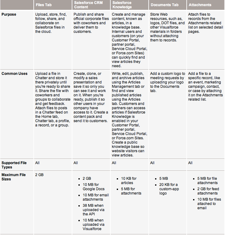
Another Help & Training guide (shown below) answers this question. It is a table that displays the purpose, common uses, supported file types, and maximum file sizes for Salesforce CRM Content, Files, Salesforce Knowledge, Documents, and Attachments. This is very supportive and useful information, but why should we need to ask for this? Shouldn’t there be one streamlined and easy-to-use location to hold all Content added to Salesforce?
Content overview
Before I go any further, let’s take a moment to describe the purpose, functions, and aspects of Salesforce CRM Content.
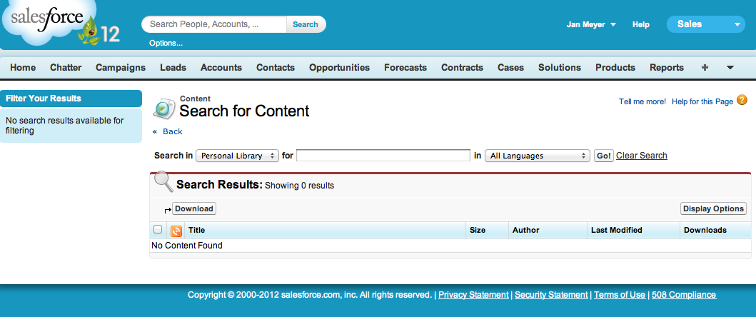
The content management system is set up with a look and feel similar to other modules in Salesforce. There is a filter pane on the left to specify the parameters of your search results, a search bar at the top that allows you to select which Library you’d like to browse through, and a Search Results section in the middle of the page.
Salesforce CRM Content makes it easy for Users to organize, search, subscribe to, contribute to, and share files within their org.
The image below depicts the Content home page, or what is viewed when clicking the Content tab in Salesforce. When I refer to the Content user interface, this is primarily what I am referencing. Granted, my screenshot contains zero content, pretend with me that this page is full of documents and files, etc.
So what’s the issue?
Perhaps you’re a fan of the user interface of this content management system. If you’ve been accessing it and are accustomed to its layout and functionality, that is understandable.
But if you’re like me, you might be wondering why this module seems a bit archaic compared to other sections of Salesforce. Yes, I do understand the functions and uses of Content. I just have a few lingering questions and concerns.
- Why do I need to make so many clicks to browse through my company’s stuff? It feels like too much work.
- Why does Salesforce elect to keep Libraries and Content separate? How come I can perform functions in the Library tab that aren’t possible in the Content tab?
- How come I cannot sync my data offline? Other options for downloading these files to my desktop are way too time-consuming.
- Can we keep Files and Documents within the same tab? Aren’t they similar enough to be grouped in one location along with the Content and Library tabs?
- As for the buttons within the Libraries tab: Contribute? Create New? Add? … I see why these are three different actions, but isn’t there an easier way?
What others are saying
If you search the word “Content” in the IdeaExchange on success.salesforce.com, 313+ results appear. Some customers are requesting a more streamlined user interface, while others want to simplify Content Delivery steps. A quick browse of Salesforce.com Answers turns up very similar results. Because of the complexity of all the modules within Salesforce that support adding files and attachments, you’d think there would be one simple master tab to view, create, and organize everything uploaded to your org.
I am sure there is a good reason we are not yet seeing this on the platform. But does anyone know why? Can anyone give a bit of insight? Are there other points within this topic that I’ve missed?
Please give your feedback! All input is appreciated.
- Internet Creations is Hiring! - May 15, 2012
- Salesforce for Government - May 8, 2012
- Salesforce Summer ’12 Release - April 26, 2012


