Key Metrics to Monitor

Author’s Note: This blog post is part of the Strategic Approach to Analytics in Salesforce series, which features the strategic approach to analytics of six leaders at Internet Creations. To view the entire series, click here.
To keep track of the company’s performance, it is crucial that every department measures certain metrics to ensure they are on the right track. These metrics are considered key performance indicators (KPI). Within KPIs, there are leading and lagging indicators. Within the organization, each department is responsible for certain KPIs. One department’s leading indicator may be another department’s lagging indicator, which is why cross-department collaboration is crucial to the success of the business.
Let’s look at the key metrics each company leader keeps in mind, starting with the CEO:
CEO
- Revenue
- Net Income
- Employee & Customer Satisfaction
Felisa Palagi, CEO at Internet Creations, glances at the “Go-To-Market Health” dashboard every morning and thoroughly reviews it weekly. This is where she tracks key metrics pertaining to revenue for Marketing, Sales, and Professional Services. Naturally, net income is an important metric for the business and determines the actual profits after expenses, taxes, and operating costs. However, due to the COVID-19 pandemic, Felisa changed the metric from revenue recognition to cash receivables. She realized that in order to maintain payroll, benefits, and other expenses, we needed to watch our cash flow closely. In fact, IC pivoted quickly and adopted Salesforce’s artificial intelligence (AI) capabilities in an effort to predict cash flow.
While not as easily quantifiable, Felisa considers employee and customer satisfaction to be a key metric. Customer satisfaction can be measured through surveys or reviews. For example, using Simple Survey we’re able to keep tabs on our customer satisfaction score which is currently 9.65/10.

Felisa focuses a lot on employee satisfaction by either reaching out to people at the company directly to check in on how they’re doing or using TinyPulse to request feedback on certain topics. After all, a great customer experience starts with a great employee experience. The higher the employee satisfaction, the higher the customer satisfaction due to the great service provided.
One of the biggest challenges for any executive is the alignment between everyone at the company. It’s crucial for managers to understand what’s going on and how they can help each other. Felisa might start at a high level, but needs to be able to drill down into each department’s metrics as well. More on alignment later on in the series. For now, let’s review each department’s key metrics.
Sales
- Weekly Activities
- Forecasted weighted Pipeline
- $ Closed Won this month
- Renewal Rate %
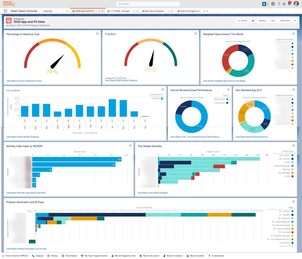
George Guhr, Director of Sales, tracks three kinds of KPIs on his dashboard: leading indicators, in-progress indicators, and lagging indicators. Leading indicators include the activity level to create opportunities. Based on that number, we can predict how many opportunities will be created in the pipeline and the likelihood of them closing. In-progress indicators are a new type of metric that George tracks to show how many opportunities were created from the sales team’s prospecting efforts. The reason he began tracking this category is because there is a lot of time between the leading and lagging indicators and he needed a reference point in the middle. Finally, lagging indicators include the quantity and dollar amount of closed won opportunities.
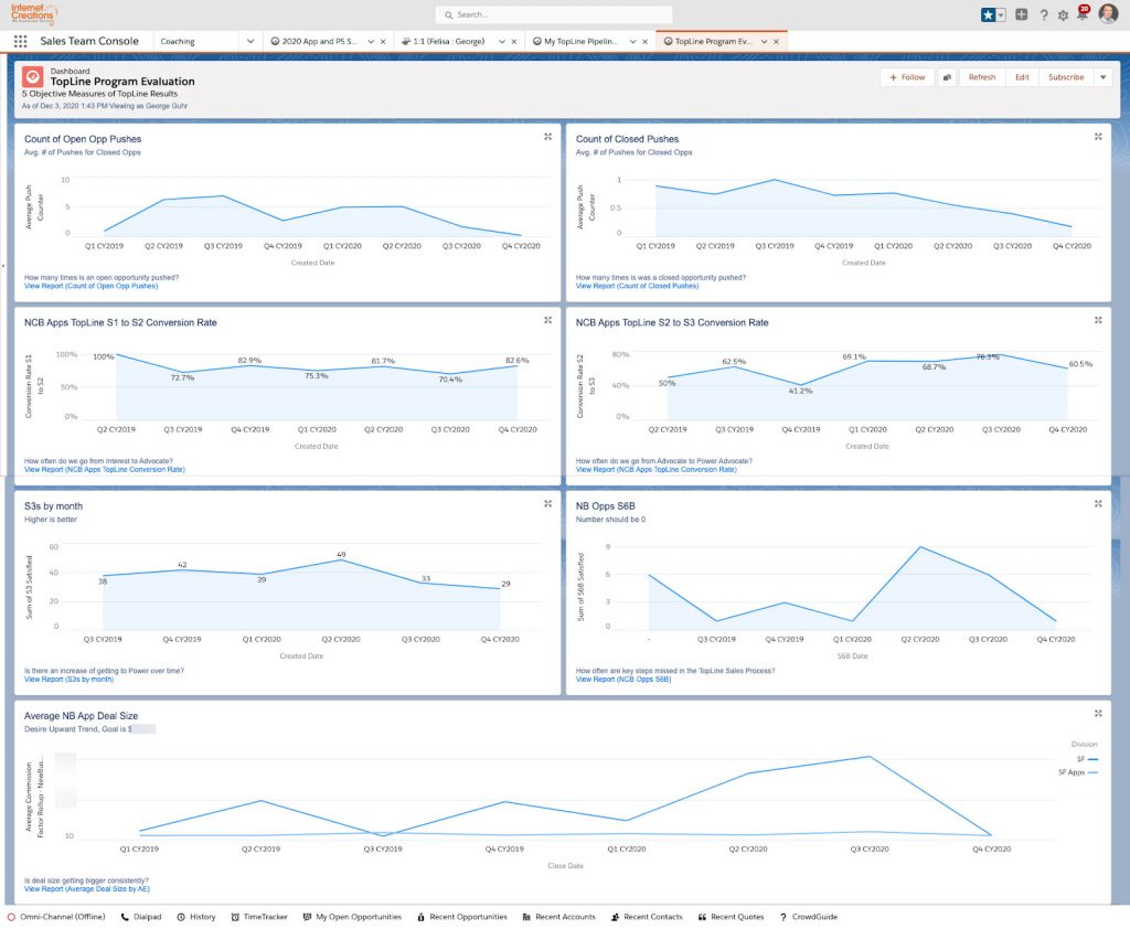
A second dashboard that George uses is the Diagnostics dashboard. This type of dashboard will answer a question and should be referred to if you want to solve a problem. For example, opportunity push counters and conversion rates might be tracked here. George might start with the KPI dashboard, see a metric that is not meeting its goal and then refer to the diagnostics dashboard to determine the issue causing it.

A third dashboard is the “Clean Your Room” dashboard, which acts as an exception report. The use of this dashboard is to get rid of or clean up bad/poor data or supply missing data. For example, if an opportunity is in a stage for too long and hasn’t progressed, it’s usually a sign that we don’t actually have an opportunity there. The exception dashboard helps with good data integrity and forecasting, which are integral to sales.
Marketing
- New Customer Growth
- Opportunity Pipeline
- Lead Generation
Marketing is focused on reaching new organizations and making them aware of solutions that can solve their business problems. One of the main components of that is the opportunity pipeline. Anthony Pica, Director of Marketing, tracks the value of opportunities as well as the count of the opportunities generated between IC’s two lines of business: Professional Services and Product/AppExchange Apps. In order to build an opportunity pipeline, IC focuses on lead generation. Naturally, Marketing tracks the leading indicators for these metrics as well, which includes working backwards from page traffic on the website and AppExchange listings.
Professional Services
- Billability
- Profitability
- Capacity
Dan Leibowitz, Director of Professional Services, refers to the annual Professional Services Maturity Benchmark Report from Kimble as outside research to help him grow and scale the team by identifying key metrics to focus on: billability, profitability, and capacity. Billability is the most common metric for professional services. It’s the percentage of time spent on work that’s billable to a customer. The higher the billability, the higher the percentage of profitability. “Sales’ job is to generate new projects and it’s Professional Services’ job to determine the resource assignments for the new work and perform the work”, says Dan. He, ideally, is looking for the ability to manage the profitability of the project in part so he can analyze how the team is doing and make changes accordingly, but also so that they can decide how to best structure their projects and the capacity of the team to fulfill the work. Capacity refers to the right amount of talent needed to fulfill the work and deliver value to the customer by ensuring high-quality service.
Product
- Case Volume & Utilization
- Knowledge Article Attachment Rate
- Community Content Activity Levels
- Time Developing Features
The Product department is responsible for managing the AppExchange apps that Internet Creations offers. This includes releasing new features and providing support. One of the key metrics that Howard Yermish, Director of Product, tracks is the case volume, including the case reason and product the case was created for. The utilization (one of the four pillars of the Service Experience Suite) of his team as well as the volume of cases determines the need for additional support reps. The knowledge article attachment rate is tracked because it indicates whether we have enough self-service resources for our customers to access and acts as an indicator of what articles we should create next. Similarly, Howard tracks the activity levels on community content such as votes or comments on ideas because he wants to be in the loop with the desires of IC’s customers and prioritize which features to develop accordingly.
Time spent on developing features is a crucial metric for Howard to track because he needs to prioritize work based on customer impact and effort. For example, if the level of effort is high, but the impact is low, then it probably won’t be prioritized. As with any company, IC has to determine the development priorities and consider how to best use the resources available. This makes the management of these resources, the priority, and level of effort of the work for a certain feature critical to keep track of.
Research & Development (R&D)
- Quality
- Predictability
- Team’s Use of Time
- Roadmap
The R&D department is responsible for developing new apps, features for existing apps, and fixing any bugs or issues. As with most products, quality is a key metric for Steve Babula, Manager of R&D. But how do you measure quality? This includes the number of bugs found and how quickly they fix them as well as the project feedback they receive for apps. Predictability is forecasting the due date and level of effort for their project and how accurate they ended up being. The metric consists of a predictive component in which the R&D team tries to predict the due date and level of effort of the work, but it also consists of a retrospective in which they review their work to see if they met their predictions. The retrospective can then inform the predictions going forward.

Steve also reports on the team’s time split between product type and reason (e.g. change request, feature request, bug) to determine the percentage of their time that is spent on building out feature requests, bug fixes, app support, and quality assurance. Currently, the team spends about 85-90% of their time on feature requests. The team has an excellent time-to-resolution for bug-fix cases. This metric represents the average amount of time from when a bug is identified in one of our apps until it is fixed. In 2020, the metric was at 6.83 business hours. This is a remarkable achievement as bug fixes at other organizations, especially larger enterprises, often take days or even weeks to resolve. Of course, this entirely depends on what you are fixing.
Finally, the roadmap represents a key deliverable. Ideas come from everywhere including customers, product team, internal stakeholders. The ideas are prioritized based on customer impact. The roadmap is organized in Salesforce and broken down by cases that are being worked on actively, next, or in the future.
Stay tuned for more…
If you enjoyed learning about the key metrics to monitor, make sure to subscribe to the Internet Creations blog by entering your information below. You will receive a monthly digest of blog posts including the next blog posts in the Strategic Approach to Analytics in Salesforce series.
Next up, we will be focusing on the Importance of Data Quality.
Enter your information to receive monthly updates featuring new posts from Internet Creations’ blog.
- Key Takeaways – Strategic Approach to Analytics - February 10, 2021
- Cross-Departmental Collaboration and Alignment - February 2, 2021
- 22 Tips and Traps with Analytics (with Admin Best Practices) - January 12, 2021


