Salesforce Trailhead Review: Lightning Design System
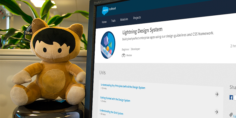
Editor’s Note: Every other Friday, Internet Creations employees of all levels of Salesforce expertise will share their experiences with Trailhead trails and modules to help you get the most out of your Trailhead time. In this review, Christina Christ, Designer at Internet Creations, provides her perspective on the Lightning Design System module. For our previous review, click here.
Responsive grid system, user interface, mobile first—all terms any Front-End Web Designer is used to hearing. And if you’re used to these terms, then you’re probably also familiar with CSS frameworks like Bootstrap or Foundation. So when Salesforce announced that they were releasing the Lightning Design System, a framework for creating a unified UI in Salesforce without having to write any CSS, I was intrigued!
So a-trailblazin’ I went!
The Lightning Design System Module
The Lightning Design System module is a part of the Develop for Lightning Experience trail and takes about two-and-a-half hours to complete. It is broken up into six units, all under or at a half-hour each. The module includes hands-on exercises that you can complete in your developer org. Developer orgs are free and take about five seconds to set up, so if you do not have one, I suggest you create one before beginning this module.
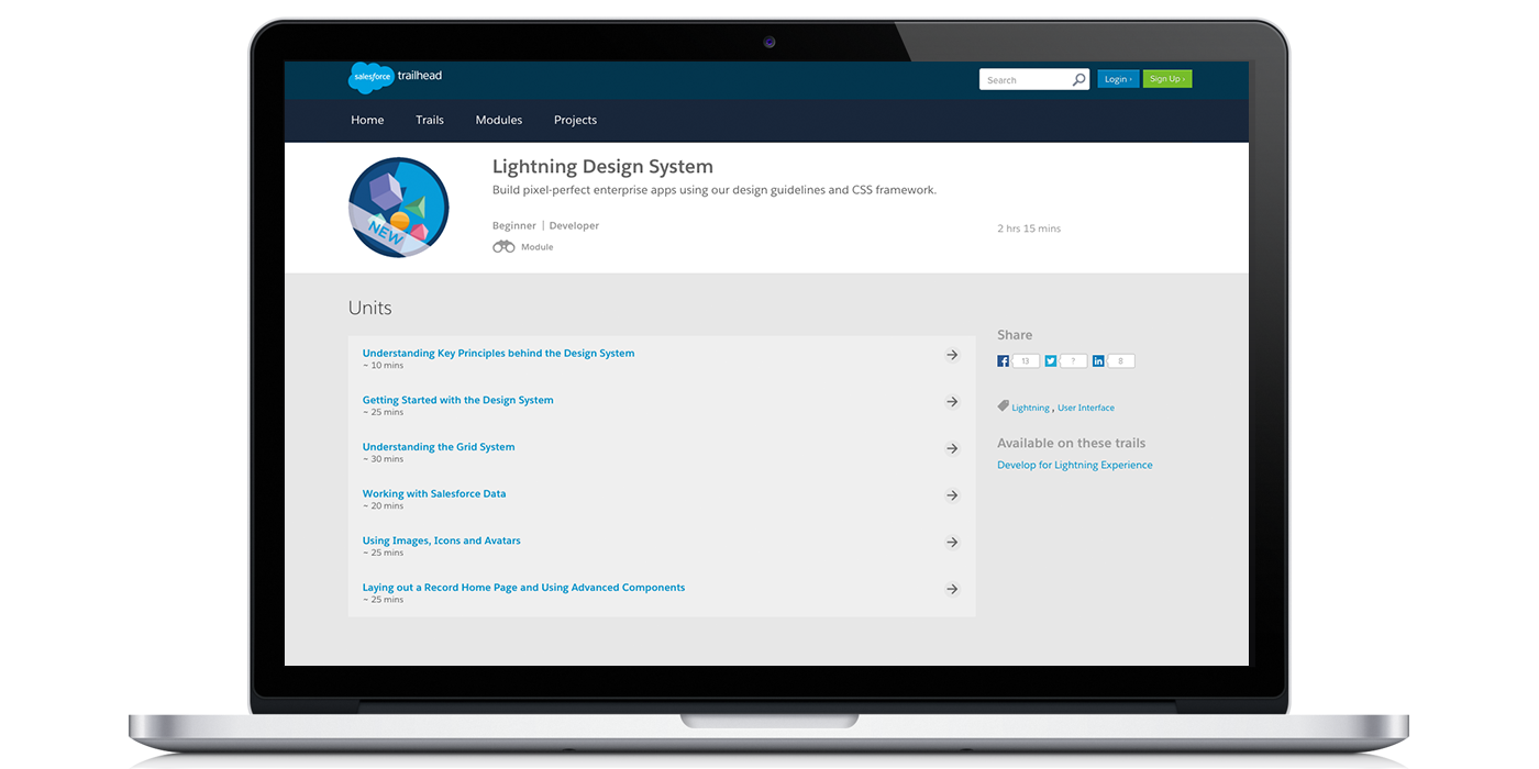
The module is broken up into six units, all under or at a half-hour each.
The design system includes four types of resources to help build applications on the Salesforce platform: a CSS framework, Icons, Font, and Design Tokens. The first unit does a good job breaking down all of the features of the Design System, including the benefits, the types of resources included, the core design principles, and where you can use the Design System.
After reading through the first unit, I was then taken through how to install the Design System to use in Visualforce. You can either choose to upload it yourself as a static resource or (the easier way) to install the unmanaged package. (I chose to travel the easier path and installed the unmanaged package!) After a quick tour of the assets/contents, I was on my way to creating my first page!
Understanding the Grid System
Ah, the unit I was most excited to get to: the grid system! You can’t have a responsive page without it! If you have used CSS frameworks in the past (like Foundation or Twitter Bootstrap), then you are familiar how a grid system works.
The grid system (which is based on CSS Flexbox) has a mobile-first approach for breakpoint specification, with breakpoints at 480px (mobile phone), 768px (tablet), and 1024px (desktop). With the sizing helper classes, you can specify column widths in ratios of 2, 3, 4, 5, 6, and 12 manually. Need a three column layout with the first column at two-thirds the page width, and two more columns at one-sixth the page width? No problem! And no time spent writing custom CSS!
The unit does a really good job of breaking down how to set up the grid system. It uses visual representations of the grid, coupled with code examples, to show exactly how the visual representations are built and which classes are applied.
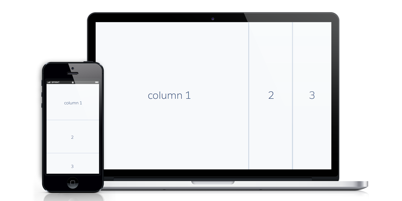
The grid system has a mobile-first approach for breakpoint specification.
Currently, the Lightning Design System does not support <apex> components. To access Salesforce data using the Design System, it is recommended to use Remote Objects, JavaScript Remoting, or the REST API. This unit uses Remote Objects but does not go into any depth with the Remote Objects script. They do provide the complete code for working within the examples, and they provide resources at the end of the unit for using Remote Objects, JavaScript Remoting, or the REST API.
With the Lightning Design System comes a whole new look and collection of icons to add to your UI, and the next unit walks through adding icons to the data table created in the last unit. The new icons are a sight for sore eyes! Unlike the old (and dare I say outdated) Salesforce icons of the past, these icons are modern, flat, and clean in design!
From there, the units walk through building a brand new page and introduces a few new components in the Design System: Card and Layout. While the module only goes over a few key components, the Lightning Design System includes a plethora of components, making adding data and interfaces to your app quick and easy!
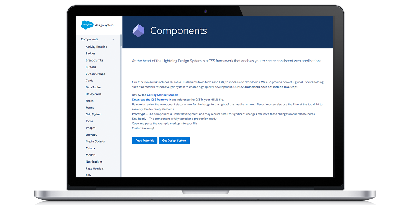
The Lightning Design System includes a plethora of components.
Bottom Line
This module is fairly quick to complete and definitely worth your time if you want to get more acquainted with the Lightening Design System. Each unit takes you through with a hands-on approach, having you add pieces at a time, so you can see exactly how the structure and page contents build. Definitely a must for Salesforce Developers and Designers!
Ready to learn more? Check out our other Trailhead reviews, or try out the Lightning Design System module for yourself!
- Using Design Thinking for More Productive Brainstorming - August 21, 2019
- 3 Things to Ask Before Implementing Salesforce Community Cloud - April 5, 2018
- 4 Ways Simple Survey Increases Response Rates - March 23, 2017


