The Lightning Experience enables Salesforce Admins to redesign the user experience and business processes within their org. The Lightning App Builder is one of the best features in Lightning because it gives Admins the power to configure the Salesforce UI using clicks, not code. Designing your Lightning Pages to fit your business users’ needs dramatically enhances their productivity. You can also get your creativity flowing as you design your pages. Let’s get to know the Lightning App Builder and see what all of this is about.
Watch the Webinar
Vicasso hosted a webinar titled “Become a Master Builder with Lightning App Builder” presented by yours truly, Benjamin Bratcher, Salesforce Consultant, and Lightning Champion. You can watch the webinar On-Demand here. If you would prefer to read through the content, please continue with the blog. The key things you will learn below are Lightning App Builder basics, customizing the UI for desktop and mobile, extending the possibilities with the AppExchange, Lightning App Builder best practices, and the new Summer ‘20 features, Dynamic Forms & Actions.
Introduction to Lightning App Builder
The UI in the Lightning Experience consists of Lightning Pages, which are made up of regions containing Lightning Components. The Lightning App Builder is used to create these Lightning Pages. It is worth noting that Lightning Pages are called FlexiPages in the Metadata API, which you might come across if you do any development or use CI/CD tools.
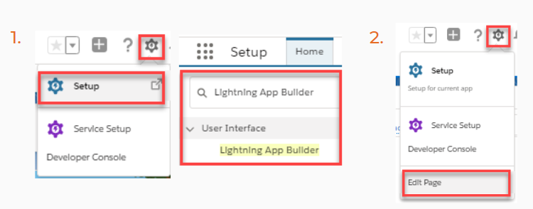
You have two options to access the Lightning App Builder.
- The first is by clicking the gear icon, “Setup”, and searching for “Lightning App Builder”.
- The second is by clicking on the gear icon and then “Edit Page” if you are already on a Lightning Page.
Walk Through of the Lightning App Builder

- The Header shows the last 10 modified pages on the left. In the center, you can see the name of the Lightning Page you are viewing. On the right, you have the back button, which takes you back to the page you were on previously and the help button, which gives you links to Salesforce Help Articles and Tips, among other resources. Tips are useful because it continues to give you tips as you build out your Lightning Page.
- The Toolbar includes buttons on the left such as undo, redo, cut, copy, and paste, which can be used while you build on the Lightning Page Canvas (see number 4). Next, you can change formats between Desktop and Phone, change the size of the canvas, and refresh the canvas without having to refresh your whole browser page. On the right, you have the save and activation buttons. The Lightning App Builder does not save automatically, so it’s important to save as you go. Using the Activation button, you can activate your page and assign it to a specific org, app, or a specific record types, apps, and profiles. More on that later.
- The Lightning Components Pane shows all available standard, custom, and custom-managed components. Standard components are the Lightning Components that Salesforce provides you out-of-the-box. Custom components are the Lightning Components that are either developed by an in-house developer or are a part of an unmanaged package. Lastly, the custom-managed components are from a managed package from the AppExchange.
- The Lightning Page Canvas is where the magic happens. Here, you drag and drop components from the Components Pane onto the canvas area to build the page.
- The Properties Pane shows page or component properties depending on what is selected. For example, you can configure component visibility or other settings here.
Design Principles to Consider
Before we review the steps needed to build a Lightning Page, let’s discuss some design principles to consider to create the best user experience possible.
Prioritize Information
Make sure to prioritize the most important information for the user by placing it in organizational components such as a tab or accordion (sections organized vertically). You can also prioritize information by placing it in the main region so that it is front and center. Furthermore, choose your templates based on the components you want to prioritize and the use cases for your pages. For example, if I want to prioritize the Chatter component, it would make sense to choose a template with a sidebar.
Customize the Pages
Customize every page for your business rather than using the default pages. Every business uses objects differently, so make sure to customize the UI to your needs. Keeping this in mind will create a much better user experience because it is customized to the way they use Salesforce.
Design for Efficiency
Design your Lightning Pages efficiently to minimize load time (for more on measuring performance, click here) and increase users’ productivity. You can do this by being strategic about what components to place on default tabs or accordions or directly on the canvas. For example, you don’t need the full related list to load every time a record is open, so why not place it behind a non-default tab so that it only loads when the user really needs to view it. This concept is called lazy loading. Only the components that are visible will load initially.
Another way to design efficiently is to surface information only when needed. You can do this using component visibility or if you are using Dynamic Forms using field or section visibility. For example, if you are using Vicasso's Case Flags app, it would make sense to only show the Case Flags component whenever a flag is actually set on the case record. Just add component visibility to the component so that it only shows up when a flag is set.
Design for Mobile
As of Winter ‘20, Salesforce has completely redesigned the mobile experience and given Admins a lot more flexibility. The mobile app now uses Lightning Pages, so don’t forget to design your Lightning Pages for mobile. In fact, you should design for mobile with “micro-moments” in mind. Consider how your users might use desktop and mobile differently. Mobile use cases often consist of smaller and quicker tasks, so make sure to configure the page to be conducive to the mobile experience. Also, make sure the components you use are optimized for mobile. Otherwise, you can use components visibility to filter by form factor to show components only for certain devices.
Building a Lightning Page
Lightning Page Type
The first step in building a Lightning Page is to select the type of Lightning page you want to create. The four options are App Page, Home Page, Record Page, and Embedded Service Page.
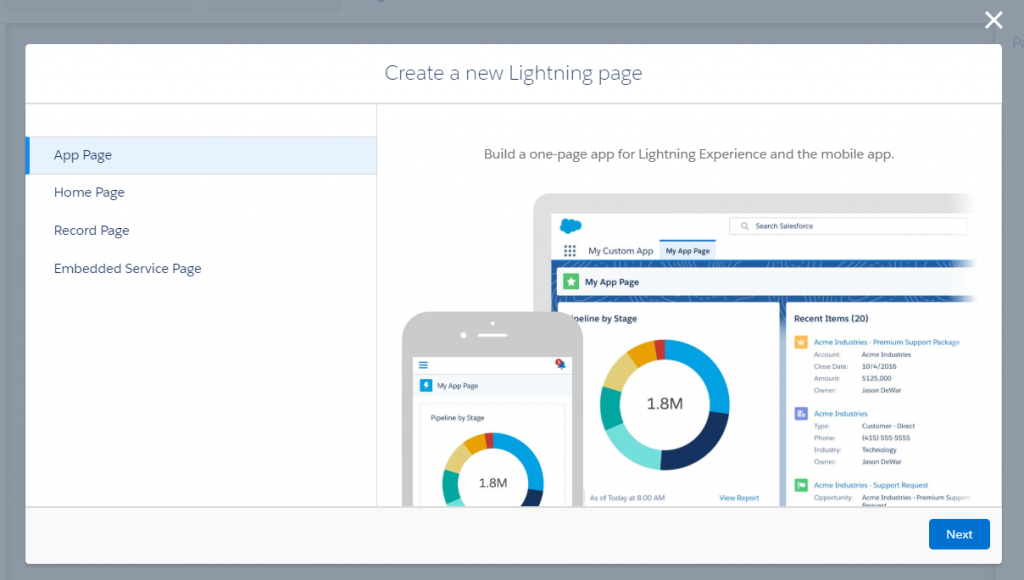
App Page
Select App Page to build a one-page app for Lightning Experience and mobile, often for internal or third-party apps that want a landing page. An App Page is great for custom Lightning Components that work together, but aren’t specific to one object or the home page.
Home Page
A Home Page provides information to users at a glance when they click on the home tab. Think of it as a landing page to give your users updates on their performance (e.g. Performance or Dashboard components) and on the items they need to take action on (e.g. Items to Approve, Today’s Tasks, Today’s Events).
Record Page
A record page represents the user interface for records of a chosen object in the Lightning Experience and mobile. You can customize the record page to fit your users’ needs.
Embedded Service Page
The Embedded Service Page only associates with the “Service Appointment” object, so this option will only show up if you have Field Service Lightning enabled.
Labeling Your Page
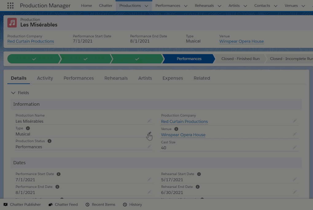
At this point, you select a label for your Lightning Page. You want to make sure to choose a label that allows you or other Salesforce Admins to easily identify what the page is used for. As a naming convention for record pages, I like to use: “Object Page Type (Additional Information)”. For example, if I am creating a record page for the case object that I plan to assign to the RCP Console app, I would name my page “Case Record Page (RCP Console)”.
For App Pages or Home Pages, I like to use the naming convention of “Page Type (App Name/Profile)”. For example, for an App Page that allows you to explore different properties, you might label it “App Page (Property Explorer)” and for a Home Page for the System Administrator profile, you might label it “Home Page (System Administrator)”.
If you are creating a Record Page, this is where you would select the object that you are creating the page for.
Lightning Page Templates
Page templates provide a base-level of organization for the Lightning Page. Generally, page templates are broken down into different regions. Most templates consist of a combination of a Header, Subheader, Sidebar, Main Region, and/or Multiple Regions.
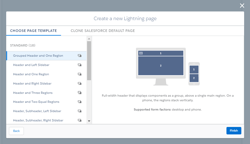
If you select “Choose Page Template”, you are provided with several different configurations that you can choose from that allow you to start from scratch with a blank framework. If you select “Clone Salesforce Default Page”, you keep the components from the default page. When you click on a template, you get a preview on the right side to show you what it would look like.
Picking the right template is important because it acts as the framework that you then build from. Consider the components that you want to highlight in your design and choose a template that is conducive to this. For example, if you want to highlight the Activity or Chatter components, choose a template that includes a Sidebar. Keep in mind that you are able to change templates on existing Lightning Pages once you have chosen one, so there is some flexibility there and you aren’t bound to one.
If the standard templates don’t meet your requirements, you have the option to create a custom Lightning Page Template if you have a developer with knowledge of Aura at your disposal. For example, a client at Vicass wanted a template that was a 50/50 split with both sides scrolling, so one of our developers built it for them. For more information on building custom templates, see “Create a Custom Lightning Page Template Component” in the Lightning Aura Components Developer Guide.
Lightning Components
Lightning Components make up the content on the Lightning Pages. You simply drag the components onto the canvas in the Lightning App Builder to start building your Lightning Page. Standard components are Lightning Components that were built by Salesforce, whereas custom components are either created by a developer or part of a managed or unmanaged package from the AppExchange.
Standard Components
Certain standard components are only available on certain page types. I won’t cover all standard components, but wanted to highlight some of the components that I find most important. For a full list of standard Lightning Components, check out the “Standard Lightning Page Components” article in Salesforce Help. For examples of how to configure some of the standard components, please watch the Building Lightning Pages demo from my webinar.
I like to group the standard components into different categories to have a better understanding of what they are used for. The components in the organization category can be used to organize other components to create a page that is easier to use. Components in the productivity category can be used to give users helpful tips and actions that they can take. Collaboration components show your collaboration both internally or externally. Functionality groups components together that have a specific type of functionality. Objects categorizes components that are specific to information on objects, whether that’s the details or related information. Lastly, the Analytics/Automation/UI category is a catch-all for all components that are specific to those. Note: this list is not exhaustive and only includes select standard components.
Organization
Accordion
Tabs
Productivity
Actions and Recommendations
Einstein Next Best Action
Path
Recent Items
Recommendations
Collaboration
Activities
Chatter
Topics
Twitter
Functionality
Highlights Panel
List View
Company Hierarchy
Event Insights
Potential Duplicates
Rich Text
Objects
Record Detail
Related Lists
Related List – Quick Links
Related List – Single
Related Record
Knowledge
Quip
Analytics/Automation/UI
Einstein Analytics Dashboard
Dashboard
Report Charts
Flow
Visualforce
Custom Components
If the standard components don’t provide the functionality you are looking for, you can either ask a developer to create a custom component for you or find components on the AppExchange. Creating a custom component requires a developer with knowledge of either the Aura or Lightning Web Components (LWC) framework. Furthermore, My Domain must be enabled. With custom Lighting Components, you can greatly extend the possibilities by creating functionality that is specific to your use case.
Custom components can also come from a managed or unmanaged package from the AppExchange provided by Salesforce or Salesforce Partners. Often, these apps allow you to scale more quickly since you don’t have to develop the component yourself and you can utilize the expertise of Salesforce Partners, which can often be more cost-effective. There are both free and paid options available on the AppExchange.
Placing Components in Template Regions
Certain Lightning components work better in certain template regions. Of course, it is completely up to you how you want to design your page, but these are some best practices that I have developed when it comes to deciding in what region to place components. Please keep in mind that the design principle of prioritizing important information should always be considered first.
- The Header is useful to show components that show key information, such as the Highlights Panel or the Path.
- The Main Region should be used to prioritize the most important information, which depends on the use case for the object. Some useful components might be Record Detail, Related Lists, Field Section, or Chatter. What is referenced most often on this record?
- The Sidebar is useful to provide supporting information to the main region. Useful components include Activities, Chatter, Related Lists, Recommendations, Related Record, Flow, or Field Section. For example, if the Record Detail is in the main region, perhaps it makes sense to show Related List – Single components on the sidebar with the most important related information on this record.
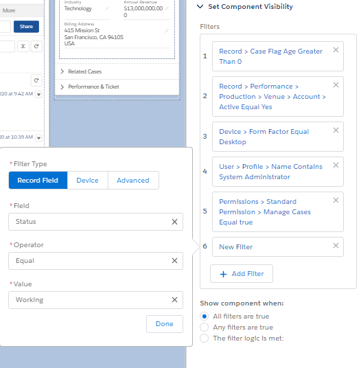
Component Visibility
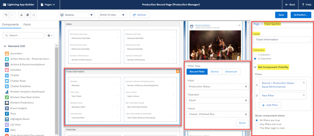
Component visibility allows you to determine when a component should be visible to the user. This feature is useful because it allows you to display components only when the information is relevant to the user. You control component visibility by adding filter conditions and logic to its properties in the Lightning App Builder. Just click on a component and the properties pane will display its properties including Component Visibility.
There are three filter types that you can choose from. These include Record Field, Device, and Advanced. The Record Field option allows you to choose a field on the object you are creating a record page for, then select an operator and a value. The Device option filters by form factor of desktop or phone, so that the component only appears for a certain device. The Advanced option allows for additional filter options either by record field or related record field (spanning up to 5 fields), permissions, user, or device. Once you have added all filters, make sure to configure the filter logic too. You can set it to show the component when “All filters are true”, “Any filters are true”, or a custom filter logic is met.
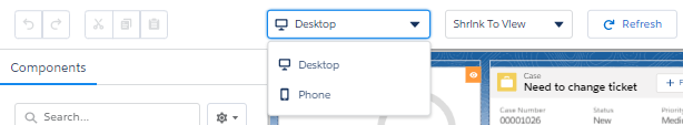
Form Factor – Desktop & Phone
As previously discussed, you can set component visibility so that the component only shows up if you are on a certain device. On top of that, you can change the display in Lightning App Builder between different form factors such as desktop and phone. Changing the form factor allows you to design the Lightning Page for different form factors and ensure that it works well on any device. It is worth noting that certain components are only visible on certain devices, so make sure to use components optimized for mobile if you are designing for mobile. If the difference between desktop and phone becomes too complex, it might be worth creating separate Lightning Pages for both form factors since you can activate pages for specific form factors.
Note: The form factors Tablet (Landscape) and Tablet (Portrait) are only available on App Pages.
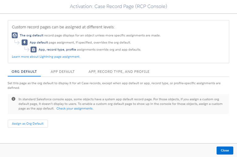
Activate your Lightning Page
When you are ready to activate your Lightning Page, click on the “Activation” in the top right. You have three options when it comes to activating your page. You can assign the Lightning Page as the Org Default, App Default, or for a specific App, Record Type, and Profile combination. It is important to note that the more specific levels of activation assignments override the broader assignments. For example, an assignment for App Default overrides the Org Default.
You can click the “Check your assignments” link to more easily see what Lightning Pages are assigned.
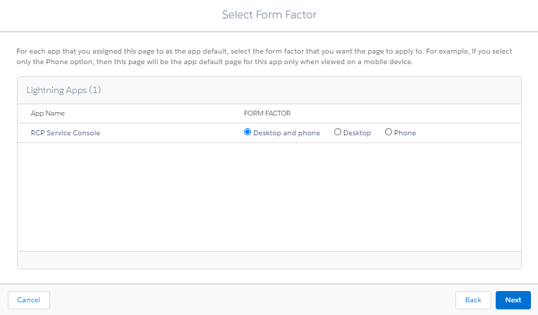
Whenever you have selected your type of assignment, you also must select your form factor. You can activate the page for Desktop and phone, Desktop, or Phone.
Best Practices for Building Lightning Pages
- Prioritize important information and ensure a better load time by using default tabs and accordions.
- Related lists need special love. I recommend setting related lists to load separately (Setup → User Interface). Consider using Related List – Single components for the most important related lists. Configure the order and the columns of related lists in the page layout.
- I recommend not placing any components below Activities and Chatter components because they tend to take up a lot of space below them due to being a feed, so any components below can easily get lost.
- Reference the tips that Lightning App Builder gives you as you are building pages. They are quite useful, especially if you are new to Lightning App Builder.
- Configure the compact layout to control the fields that show up in the Highlights Panel.
- Configure the Mobile & Lightning Experience Actions in the page layout to control the actions available and the order of actions in the Highlights Panel, Activities, and Chatter components.
- Click on the component to view its properties and make additional changes such as component visibility filters. You can also see the layout the component is referencing, for example.
- Design for both mobile and desktop by switching the form factor and utilizing component filters to select the devices they should appear on.
Introducing Dynamic Forms and Dynamic Actions
Dynamic Forms (Non-GA Preview) and Dynamic Actions (Beta) are new features being released in Summer ‘20 that allow you to split the details of a record into separate sections and control and filter the actions from the Lightning App Builder. These features will eventually allow users to move away from a dependency on the page layout allowing them to control the fields and actions from the Lightning App Builder.
Dynamic Forms
In order to activate Dynamic Forms, navigate to Setup and search for “Record Page Settings”. Once there, toggle the switch to turn on Dynamic Forms.
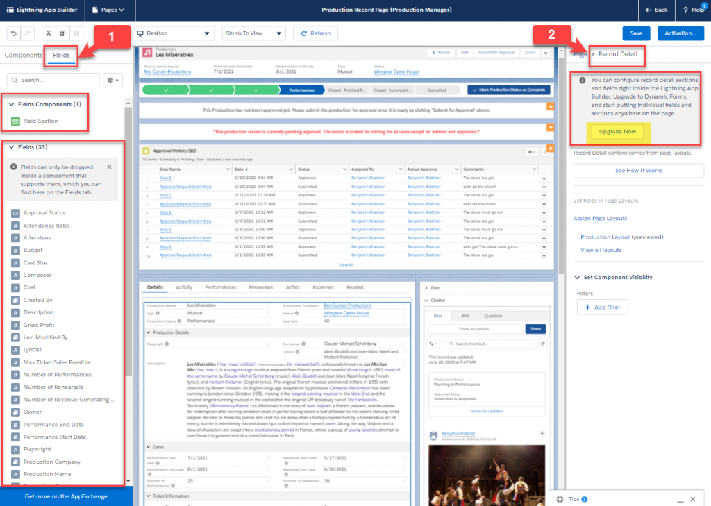
Once this setting has been activated, a new tab will appear in the Lightning Components Pane of the Lightning App Builder. The “Fields” tab (1) allows you to drag and drop a “Field Section” onto the canvas and place individual fields into that section. This way you can build out your record detail from scratch.
The other option is to click on the “Record Detail” component and click “Upgrade Now” to walk through the wizard (2). In the setup wizard, you choose the page layout you want to turn into dynamic forms and Salesforce does all the work for you by dividing each of your sections on the page layout into Dynamic Form field sections and optionally placing them into an accordion component.
Regardless of how you create the field sections, you can move them anywhere you want on the canvas. This new feature is highly anticipated and ranked as the #1 idea on the IdeaExchange. The possibilities are endless in terms of how you might want to customize your Lightning Page using Dynamic Forms.
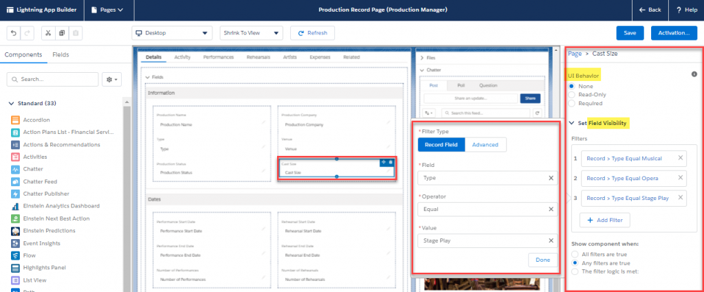
The options become even more exciting when you take different functionality with Dynamic Forms into accounts. It is possible to set the UI Behavior of individual fields. The options available are None, Read Only, or Required. Just click on the field and customize the UI Behavior on the Properties Pane. You also have the option to set field visibility, which is similar to component visibility, only for the individual field. The visibility can be set based on record fields, user fields, or permissions.
The user experience of field visibility is excellent. You just change the criteria to meet the field visibility filters and the field instantly appears. If the criteria does not match the filters, then it disappears. None of this requires the page to reload. I can think of countless implementations of this functionality. For example, you might have a checkbox that displays other fields if it is checked. That way, the additional fields only appear when they are relevant to the user.
Field Sections can be customized by adding a label and choosing whether to display the section with one or two columns. You can also set component visibility on field sections. This experience is the same as the component visibility functionality we mentioned earlier in the post.
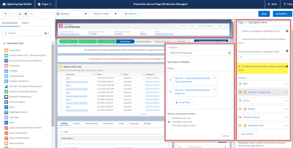
Dynamic Actions
Dynamic Actions allow you to add individual actions to the Highlights Panel component and add in action filters. You can enable Dynamic Actions by going to the Highlights Panel component and check “Enable Dynamic Actions”. Once you do this, the actions that were configured on the page layout disappear. You must then add actions individually. The Action Visibility setting is fantastic because you can filter either by record field, device, user field, or permission, which allows you to be more flexible with your actions. For example, in the screenshot below, I set the Submit for Approval action to only be visible if the Approval Status is either Not Submitted or Rejected.
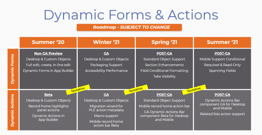
Roadmap for Dynamic Forms and Dynamic Actions
The roadmap is subject to change and Salesforce recommends only making purchasing decisions based on features that are generally available (GA). As of the Summer ‘20 release, Dynamic Forms (Non-Preview GA) and Actions (Beta) are only available on desktop for custom objects. Salesforce is anticipating these features to be GA for desktop and custom objects in Winter ‘21 (safe-harbor). In Spring ‘21, Salesforce plans to add the functionality to standard object support. In Summer ‘21, mobile support will be added.
Best Practices and Considerations for Dynamic Forms and Dynamic Actions
- Use tabs and accordions to organize field sections with Dynamic Forms.
- Use visibility filters for relevant information. Especially exciting are the additions of field visibility, component visibility on field sections, and action filtering. Rethink your design to be “just in time”, meaning the information shows up when the user needs it.
- By using visibility filtering by profile and/or record type, you can keep everything on one page as opposed to needing multiple page layouts or Lightning Pages.
- There are special considerations when using both Dynamic Forms and the standard record detail component. You have to keep both updated, so when you start using Dynamic Forms for an object, I recommend switching over completely.
- Related Lists must still be controlled on page layouts as of Summer ‘20.
Conclusion
- Lightning App Builder is a powerful tool for Admins by allowing you to declaratively customize the UI.
- The Lightning Experience is designed differently than Classic. Redesign your business processes when using Lightning to take advantage of the new features.
- Design Lightning Pages to fit your business use cases instead of using default Lightning Pages. While you can get by using default pages, you can get much more return on your investment in Salesforce by customizing the UI to fit your needs.
- Familiarize yourself with Dynamic Forms & Actions because it’s the future. There is an exciting roadmap ahead for these features.
Resources
- Lightning App Builder
- Quick Start: Lightning App Builder
- Salesforce Help: Lightning App Builder
- Metadata API Developer Guide FlexiPage
- Lightning App Builder Considerations
- Be An Innovator with Dynamic Pages
- Dynamic Forms & Actions Roadmap